Posted on Tue 05 March 2013

Visualising Change in Presidential Votes

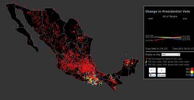
Click on the image to visit the interactive version (Spanish)
I liked this visualization by the New York Times of the US presidential election so much I decided to recreate it using Mexican data, and in the process added a slope graph. So go visit my new visualization of the change in presidential vote from 2006 to 2012 at the municipality level. I recommend using chrome to view the visualisation, there’s also a Spanish version.


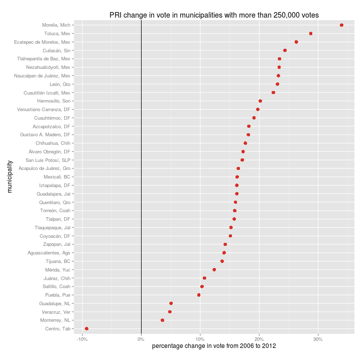
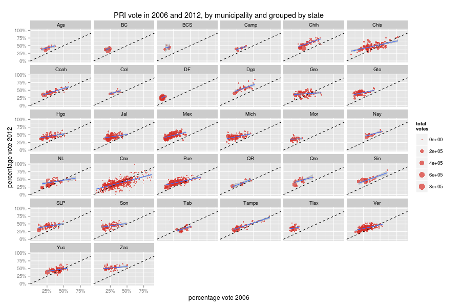
The PRI gained votes in almost all the big municipalities save for Villahermosa (Centro). The home state of AMLO.

Not everyone was happy with the post-election protests of the PRD candidate. Interestingly, he did gain votes in several of the municipalities that make up the Monterrey and Guadalajara metro areas.
People in Villahermosa must really hate the PRI. I was not surprised to see the PAN lose votes in Culiacán, Juárez, Chihuahua, Cuernavaca, Tijuana, Zapopan, Guadalajara, Monterrey…
Scatter plots of votes in 2006 vs votes in 2012:


P.S. The code for the interactive chart is here


Unless otherwise stated, the content of this page is licensed under the Creative Commons Attribution 3.0 License, and code samples are licensed under the Apache 2.0 License. Privacy policy

Disclaimer: This website is not affiliated with any of the organizations or institutions to which Diego Valle-Jones belongs. All opinions are my own.

Special Projects:

Blogs I like: