1) Make public the total score for the test. When you only have access to the population percentiles who reach a certain level of proficiency it gives the impression that they don’t want reporters to summarize the test results in an easy way. Plus with all the multiple comparisons you’ll always be able to say that students improved their scores at some level.
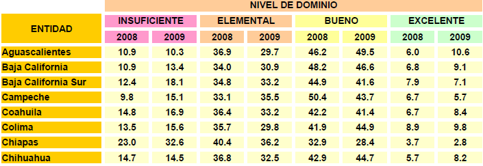
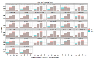
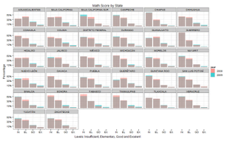
2) Graphs are better than tables. Look at the difference between the table [PDF] and the charts below (the table is in Spanish but easy to understand):

Just by looking at the graphs you can tell immediately that scores mostly stayed the same, the students marginally improved their scores in math while their scores in reading (lectura) were worse. The math scores don’t look normal at all and they are much lower than the reading scores which do look somewhat normal. Chiapas, Guerrero and Sinaloa experienced the biggest decreases in reading scores.
3) The SEP should really consider making probability density plots, they would be even easier to understand than looking at percentages. Ha ha!

