Posted on Thu 24 December 2009

Another Visualization of Unemployment

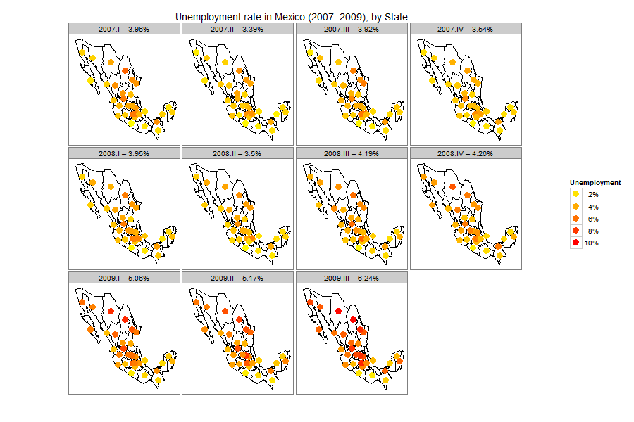
One of the problems with choropleths is that, as explained by Hadley Wickham in this presentation, big states tend to draw more attention because of their size, but they also tend to have a low population Density. For example, Mexico City, the capital of Mexico and it’s industrial and economic center, with over 8 million people is barely visible in the map. One solution is to draw a circle in the center of each state.
Unemployment Rate Bubbles
The code for the chart is available from Github


Unless otherwise stated, the content of this page is licensed under the Creative Commons Attribution 3.0 License, and code samples are licensed under the Apache 2.0 License. Privacy policy

Disclaimer: This website is not affiliated with any of the organizations or institutions to which Diego Valle-Jones belongs. All opinions are my own.

Special Projects:

Blogs I like: