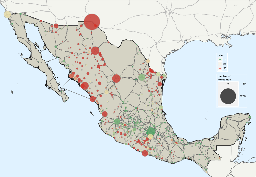
It turns out it is really easy to customize maps with Fusion Tables and the Maps API so I recreated the above map of the number and rate of drug-related homicides by municipality or metropolitan area.
It turns out it is really easy to customize maps with Fusion Tables and the Maps API so I recreated the above map of the number and rate of drug-related homicides by municipality or metropolitan area.
Drugs Enter Here: Waypoints: (Ctrl-Click for multiple selection)
Exit:
The legend is the same as in the first map: the green colors correspond to lower rates and the reds to higher ones. I capped the maximum rate at 50 to make it easier to distinguish the municipalities. Make sure you check out the terrain view.
My email list is pretty simple: one email for each new post or project. If you join over 5,000 subscribers from Harvard, Stanford, Google, McKinsey... you'll receive as a welcome gift the 100+ shapefiles of Mexico you will ever need (It's more than 5GB of data and totally free).Privacy Policy