Thanks to an information request to the SSP‑CDMX hoyodecrimen.com now has crime data at the latitude and longitude level. You can access the data systematically using the API or download it in full. In this post I’ll provide many examples of how to manipulate the API to create maps.
I.
First, we’ll load the R packages we need:
1 2 3 4 5 6 7 8 9 10 11 12 13 14 15 16 17 18 19 20 21 22 | library("DCluster")
library("jsonlite")
library("RCurl")
library("jsonlite")
library("rgdal")
library("rgeos")
library("ggplot2")
library("ggmap")
library("RColorBrewer")
library("stringr")
library("scales")
library("geojsonio")
library("downloader")
library("spdep")
library("viridis")
library("maptools")
library("rvest")
library("dplyr")
library("stringr")
library("stringi")
library("geojsonio")
library("knitr")
|
Then, we’ll download a list of all crimes available from hoyodecrimen (since the data comes from FOIA request the specific crimes available may vary depending on when you access the API). To do this, we can use the jsonlite package to convert the JSON data the API endpoints return into data.frames.
1 2 | crimes <- fromJSON("https://hoyodecrimen.com/api/v1/crimes")$rows
kable(crimes, caption = 'List of crimes available from hoyodecrimen.com')
|
| crime |
|---|
| HOMICIDIO DOLOSO |
| LESIONES POR ARMA DE FUEGO |
| ROBO A BORDO DE METRO C.V. |
| ROBO A BORDO DE METRO S.V. |
| ROBO A BORDO DE MICROBUS C.V. |
| ROBO A BORDO DE MICROBUS S.V. |
| ROBO A BORDO DE TAXI C.V. |
| ROBO A CASA HABITACION C.V. |
| ROBO A CUENTAHABIENTE C.V. |
| ROBO A NEGOCIO C.V. |
| ROBO A REPARTIDOR C.V. |
| ROBO A REPARTIDOR S.V. |
| ROBO A TRANSEUNTE C.V. |
| ROBO A TRANSEUNTE S.V. |
| ROBO A TRANSPORTISTA C.V. |
| ROBO A TRANSPORTISTA S.V. |
| ROBO DE VEHICULO AUTOMOTOR C.V. |
| ROBO DE VEHICULO AUTOMOTOR S.V. |
| VIOLACION |
All requests to the API start with the address https://hoyodecrimen.com/api/v1/ followed by the specific path of the data you want, sometimes with query parameters (the part of the url followed by ?) specifying the start and end dates of the data you need.
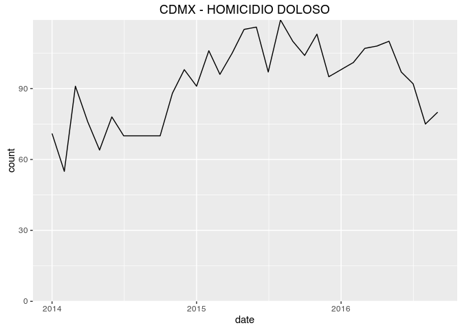
If you wanted to download the sum of all murders commited in CDMX since 2014 you’d look up the appropriate method in the documentation. And then use the following code to create a chart:
1 2 3 4 5 6 | # Note that since the crime we want to graph, 'Homicidio Doloso',
# contains a space we need to encode the URL
homicidio_series <- fromJSON(str_c("https://hoyodecrimen.com",
URLencode("/api/v1/df/crimes/HOMICIDIO DOLOSO/series?start_date=2014-01&end_date=2016-09")))$rows
kable(head(homicidio_series), caption = 'Homicides in CDMX since 2014')
|
| count | crime | date | population |
|---|---|---|---|
| 71 | HOMICIDIO DOLOSO | 2014-01 | 8785911 |
| 55 | HOMICIDIO DOLOSO | 2014-02 | 8785911 |
| 91 | HOMICIDIO DOLOSO | 2014-03 | 8785911 |
| 76 | HOMICIDIO DOLOSO | 2014-04 | 8785911 |
| 64 | HOMICIDIO DOLOSO | 2014-05 | 8785911 |
| 78 | HOMICIDIO DOLOSO | 2014-06 | 8785911 |
1 2 3 4 5 | ggplot(homicidio_series, aes(as.Date(str_c(date, "-01")), count)) +
geom_line() +
ggtitle("CDMX - HOMICIDIO DOLOSO") +
xlab("date") +
scale_y_continuous(expand = c(0, 0), limits = c(0, max(homicidio_series$count)))
|
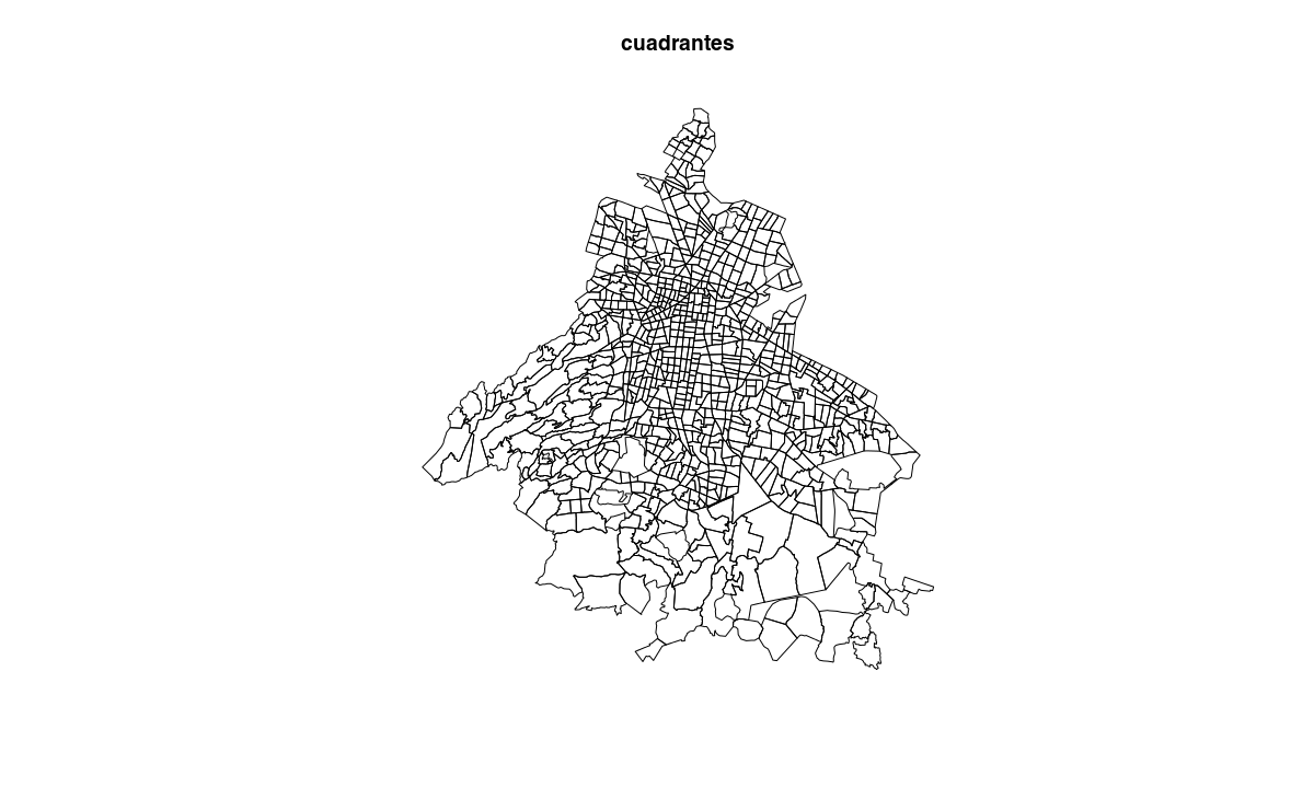
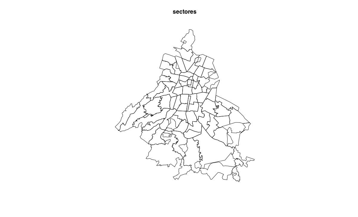
We can also download geojson maps of cuadrantes and sectores which we can convert to SpatialPolygonsDataFrame to work with in R.
1 2 3 4 5 6 7 8 9 10 11 12 | # create a tempory to save the geojson from the API
tmp_cuadrantes = tempfile("cuads", fileext = ".json")
download("https://hoyodecrimen.com/api/v1/cuadrantes/geojson", tmp_cuadrantes)
# read the geojson into a spatial object
cuadrantes = readOGR(tmp_cuadrantes, "OGRGeoJSON", verbose = FALSE)
tmp_sectores = tempfile("secs", fileext = ".json")
download("https://hoyodecrimen.com/api/v1/sectores/geojson", tmp_sectores)
sectores = readOGR(tmp_sectores, "OGRGeoJSON", verbose = FALSE)
plot(cuadrantes, main = "cuadrantes")
plot(sectores, main = "sectores")
|
II.
Now that we have the maps, we can download period data (by default the last twelve months) for all crimes and merge them. Then use the ggmap package to create choropleths on top of a Google Maps image.
1 2 3 4 5 6 7 8 9 10 11 12 13 14 15 16 17 18 19 20 21 22 23 24 25 26 27 28 29 | crime.sectors <- fromJSON("https://hoyodecrimen.com/api/v1/sectores/all/crimes/all/period")$rows
#fortify the data for ggplot2
fsectors <- fortify(sectores, region = "sector")
sector.map <- left_join(fsectors, crime.sectors, by = c("id" = "sector"))
sector.map$rate <- sector.map$count / sector.map$population * 10^5
crime.cuadrantes <- fromJSON("https://hoyodecrimen.com/api/v1/cuadrantes/all/crimes/all/period")$rows
fcuadrantes <- fortify(cuadrantes, region = "cuadrante")
cuadrante.map <- left_join(fcuadrantes, crime.cuadrantes, by = c("id" = "cuadrante"))
cuadrante.map$rate <- cuadrante.map$count / cuadrante.map$population * 10^5
draw_gmap <- function(map, crimeName, bb, pal, fill = "rate", alpha=.9) {
ggmap(get_map(location = bb)) +
geom_polygon(data= subset(map, crime == crimeName),
aes_string("long", "lat", group = "group", fill = fill),
color = "#666666", size = .1,
alpha = alpha) +
coord_map() +
ggtitle(crimeName) +
#scale_fill_viridis(option="plasma") +
scale_fill_continuous(low = brewer.pal(9, pal)[1],
high = brewer.pal(9, pal)[9],
space = "Lab", na.value = "grey50",
guide = "colourbar") +
theme_nothing(legend = TRUE)
}
bb.sector <- bbox(sectores)
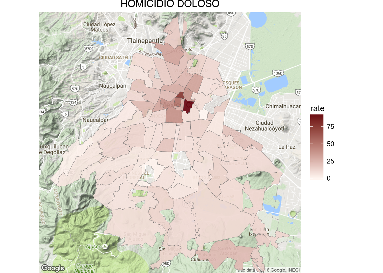
draw_gmap(sector.map, "HOMICIDIO DOLOSO", bb.sector, "Reds", "rate")
|
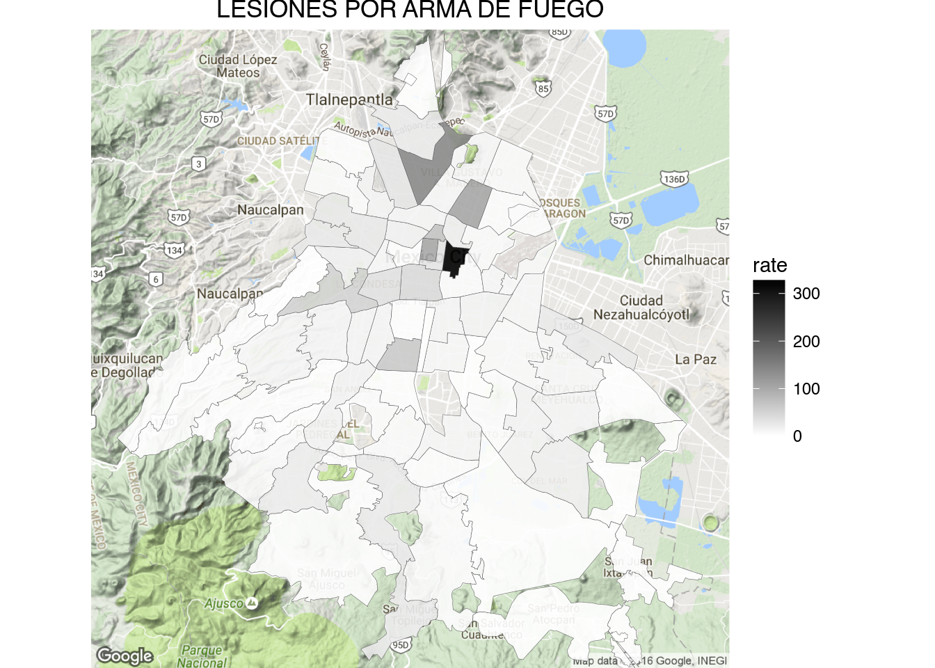
1 | draw_gmap(sector.map, "LESIONES POR ARMA DE FUEGO", bb.sector, "Greys", "rate")
|
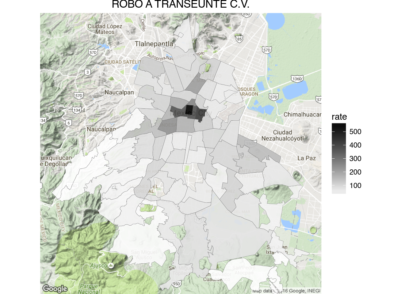
1 | draw_gmap(sector.map, "ROBO A TRANSEUNTE C.V.", bb.sector, "Greys", "rate")
|
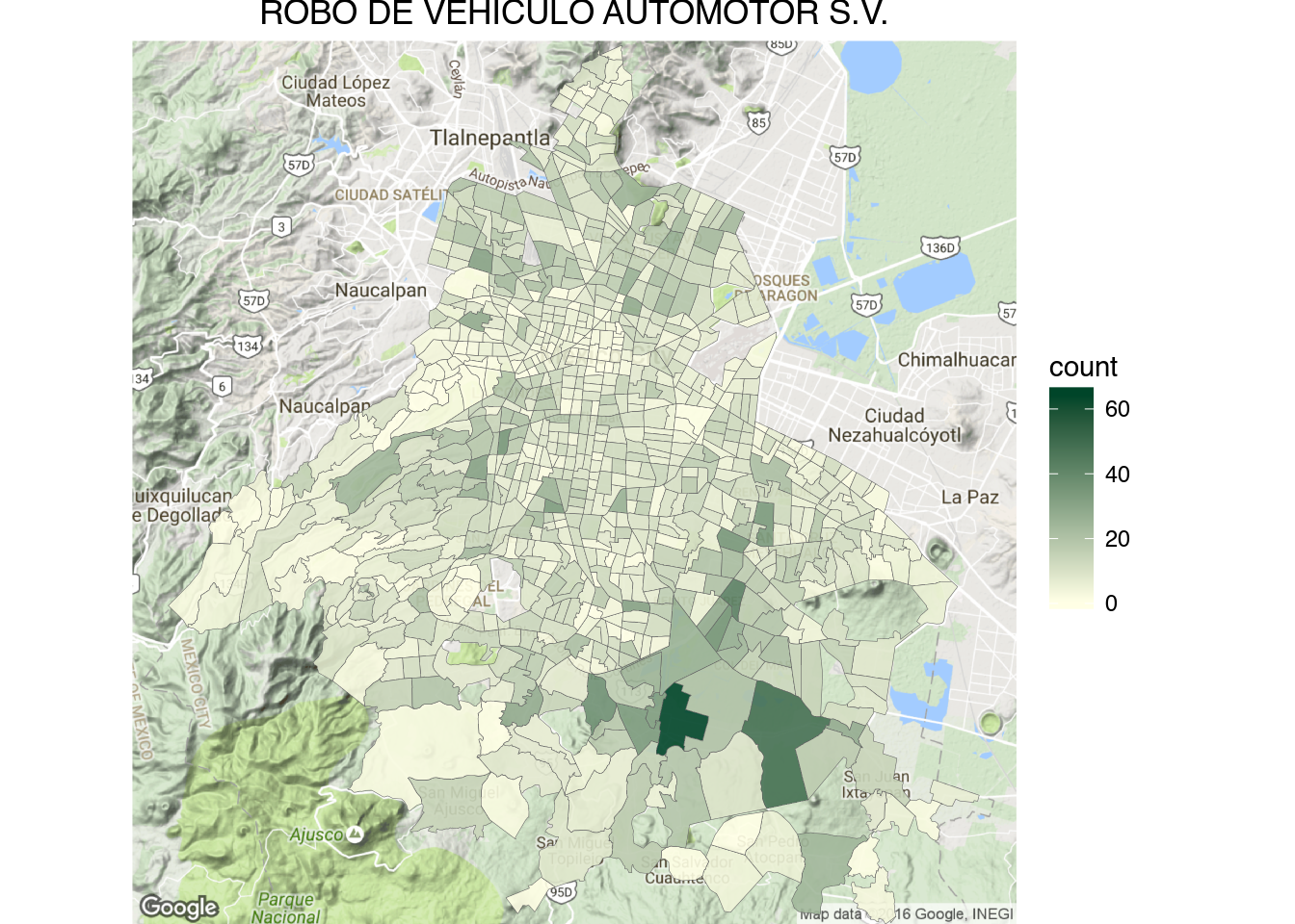
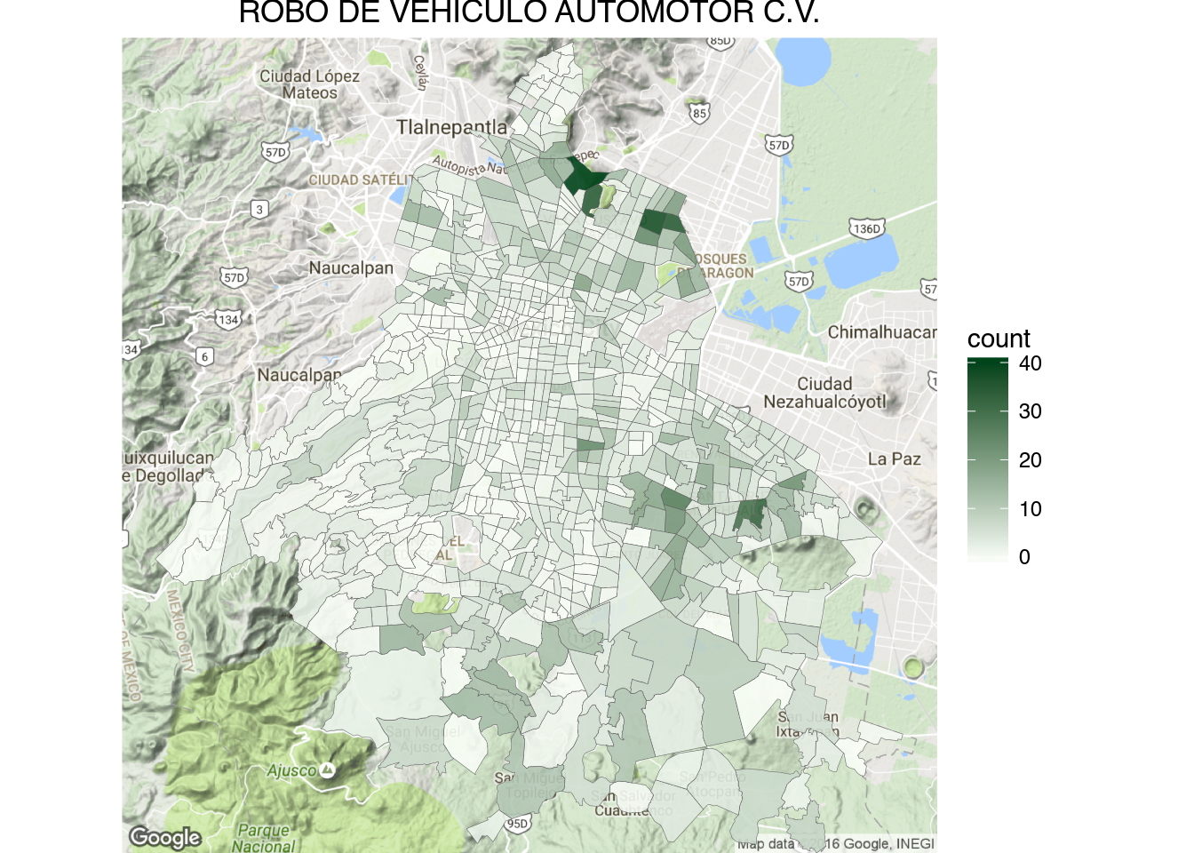
1 | draw_gmap(cuadrante.map, "ROBO DE VEHICULO AUTOMOTOR S.V.", bb.sector, "YlGn", "count")
|
1 | draw_gmap(cuadrante.map, "ROBO DE VEHICULO AUTOMOTOR C.V.", bb.sector, "Greens", "count")
|
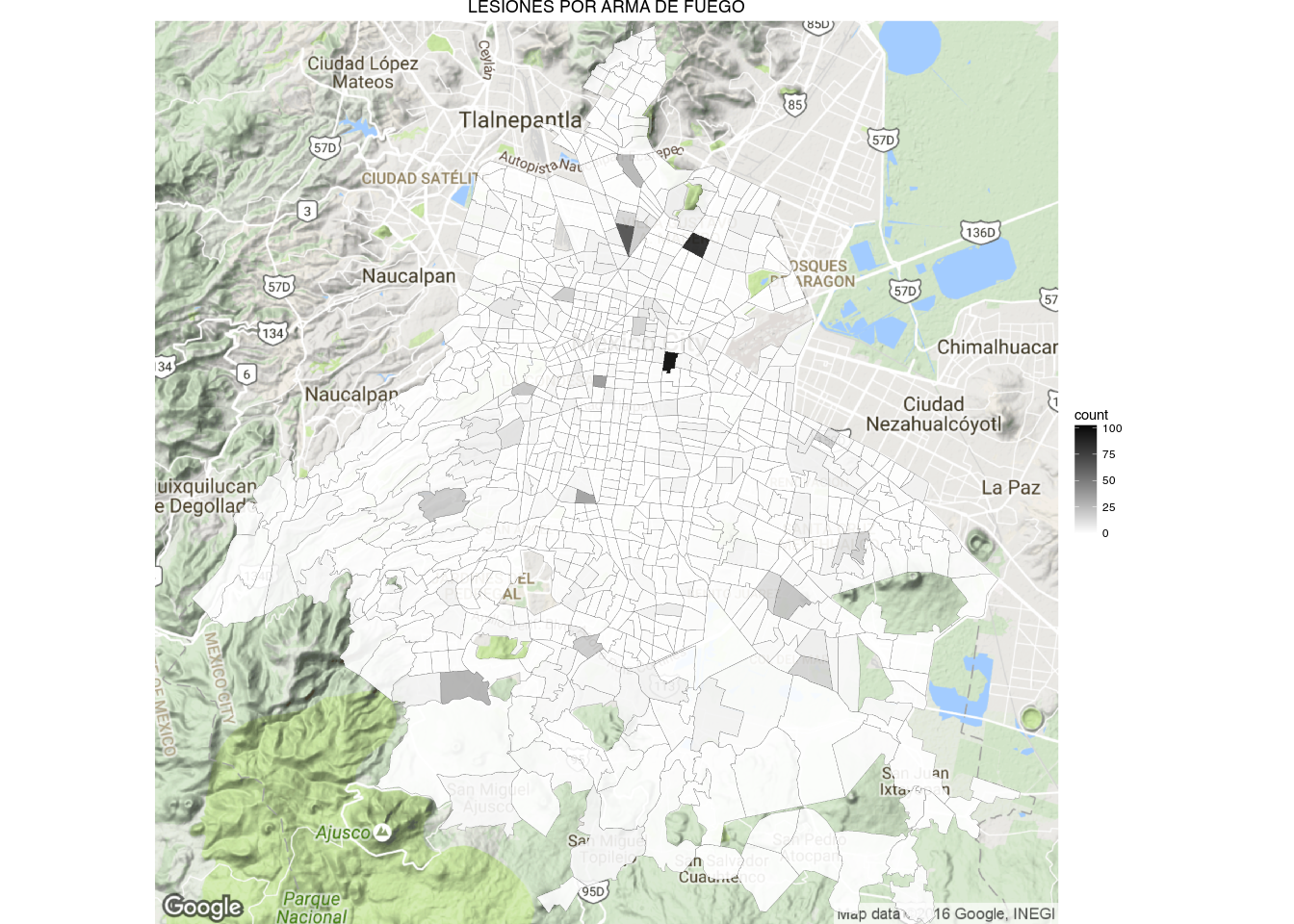
1 | draw_gmap(cuadrante.map, "LESIONES POR ARMA DE FUEGO", bb.sector, "Greys", "count")
|
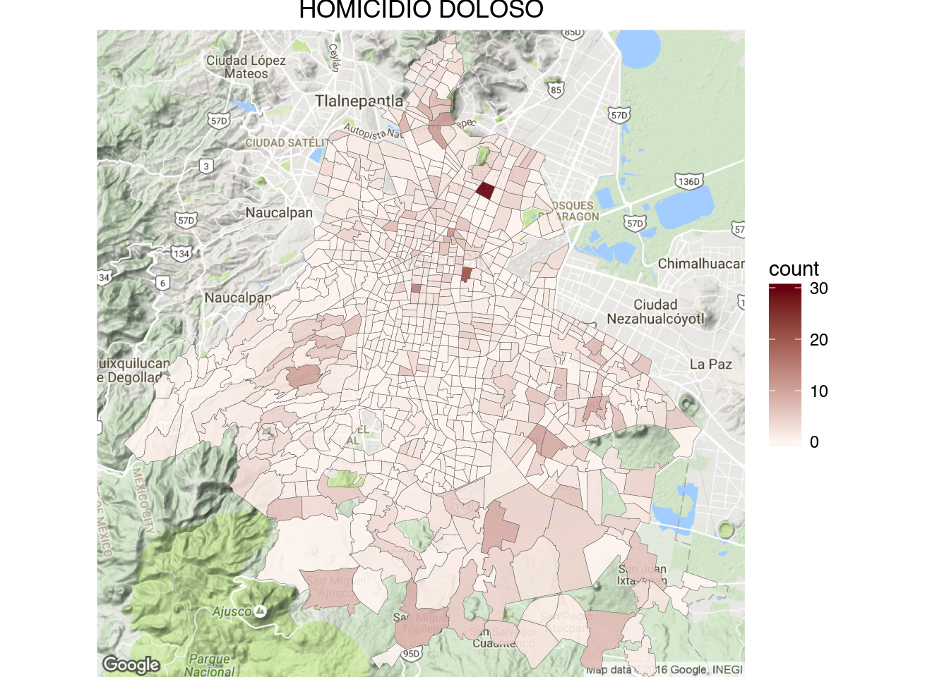
1 | draw_gmap(cuadrante.map, "HOMICIDIO DOLOSO", bb.sector, "Reds", "count")
|
III.
One thing that you may have noticed from the ‘Homicidio Doloso’ and ‘Lesiones por Arma de Fuego’ cuadrante maps is that the cuadrantes that contain hospitals tend to have very high homicides counts (dark red and gray in the maps).
We can investigate the phenomena further by downloading the coordinates of homicides and firearm lesions within 1,000 meters of hospitals.
1 2 3 4 5 6 7 8 9 10 11 12 13 14 15 16 17 18 19 20 21 22 23 24 25 26 27 28 29 30 31 32 33 34 35 36 37 38 39 | #function to download a cuadrante given a latitude and longitude
get_cuadrante <- function(long, lat){
tmp_file = tempfile(fileext = ".geojson")
write(fromJSON(str_c("https://hoyodecrimen.com/api/v1/cuadrantes/pip/",long,"/",lat))$pip$geometry,
file = tmp_file)
cuad <- geojson_read(tmp_file, method = "local", what = "sp")
cuad.f <- fortify(cuad)
}
#function to create a point map of crimes with their cuadrante
latlong_map <- function(title, lat, long, distance, crime = "HOMICIDIO DOLOSO",
fill = "red") {
geocrimes <- fromJSON(str_c("https://hoyodecrimen.com/api/v1/latlong/crimes/",
URLencode(crime), "/coords/",
long,
"/",
lat,
"/distance/",
distance,
"?start_date=2013-01&end_date=2016-09"))$rows
cuadrante.f <- get_cuadrante(long, lat)
bb <- bbox(coordinates(geocrimes[,c("long", "lat")]))
ggmap(get_map(location = bb)) +
geom_polygon(data = cuadrante.f, aes(long, lat, group = group),
color = "black", fill = "yellow", alpha = .2) +
geom_point(data= subset(geocrimes, crime == crime),
aes(long, lat),
fill = fill,
color = "black",
size = 3,
shape = 21,
alpha = .8) +
ggtitle(title) +
theme_nothing(legend = TRUE)
}
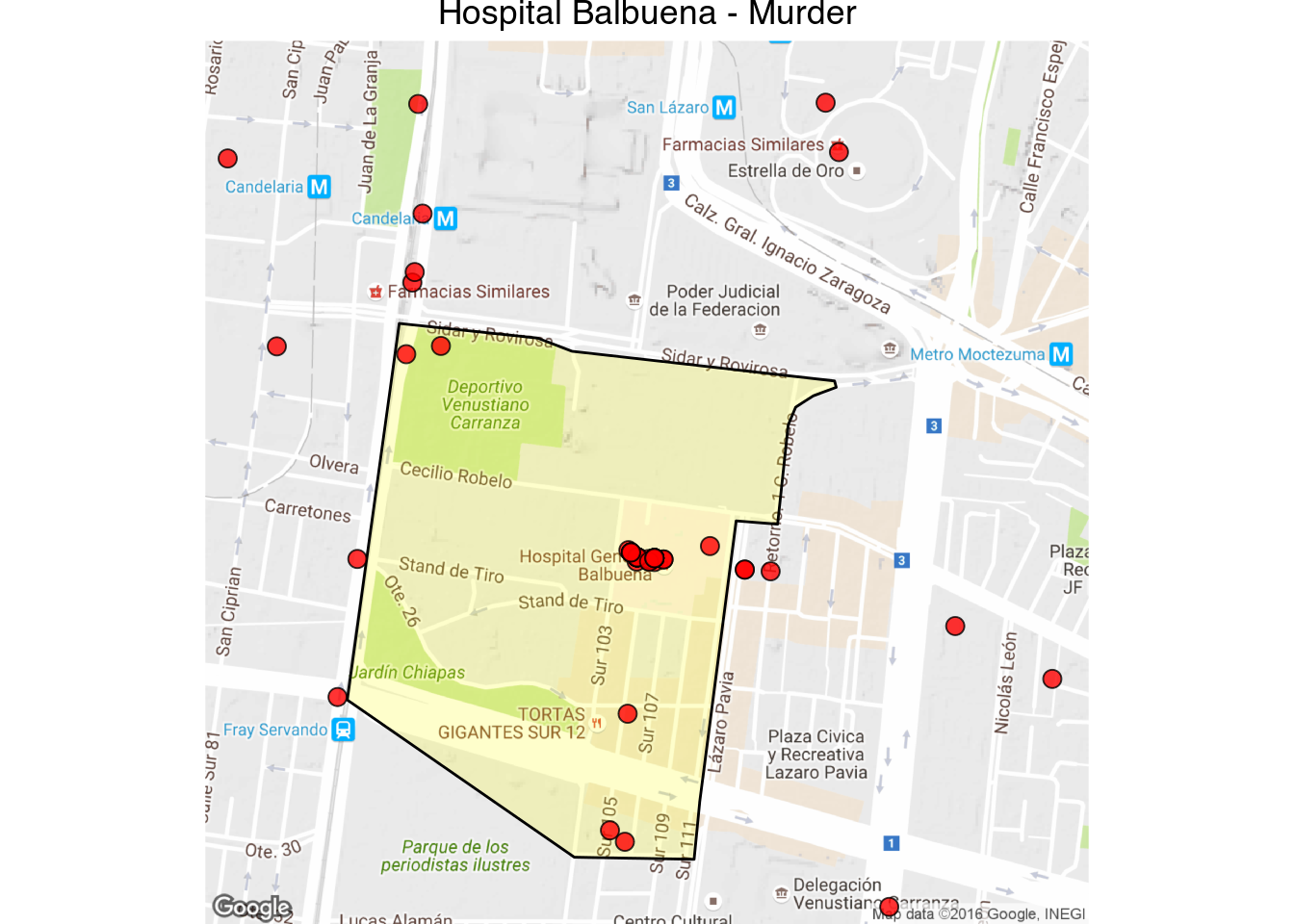
latlong_map("Hospital Balbuena - Murder", 19.42410, -99.115520, 1000)
|
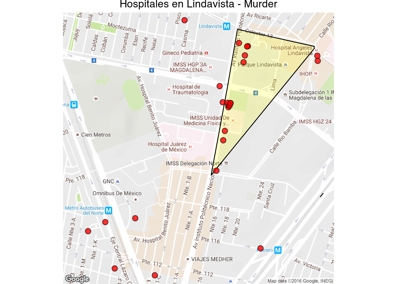
1 | latlong_map("Hospitales en Lindavista - Murder", 19.482973, -99.134091, 1000)
|
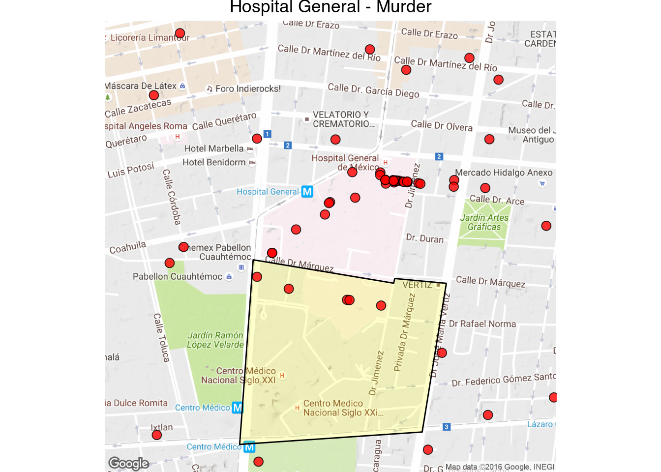
1 | latlong_map("Hospital General - Murder", 19.411300, -99.152405, 1000)
|
Interactive Map - Note that there is a second hospital in another cuadrante.
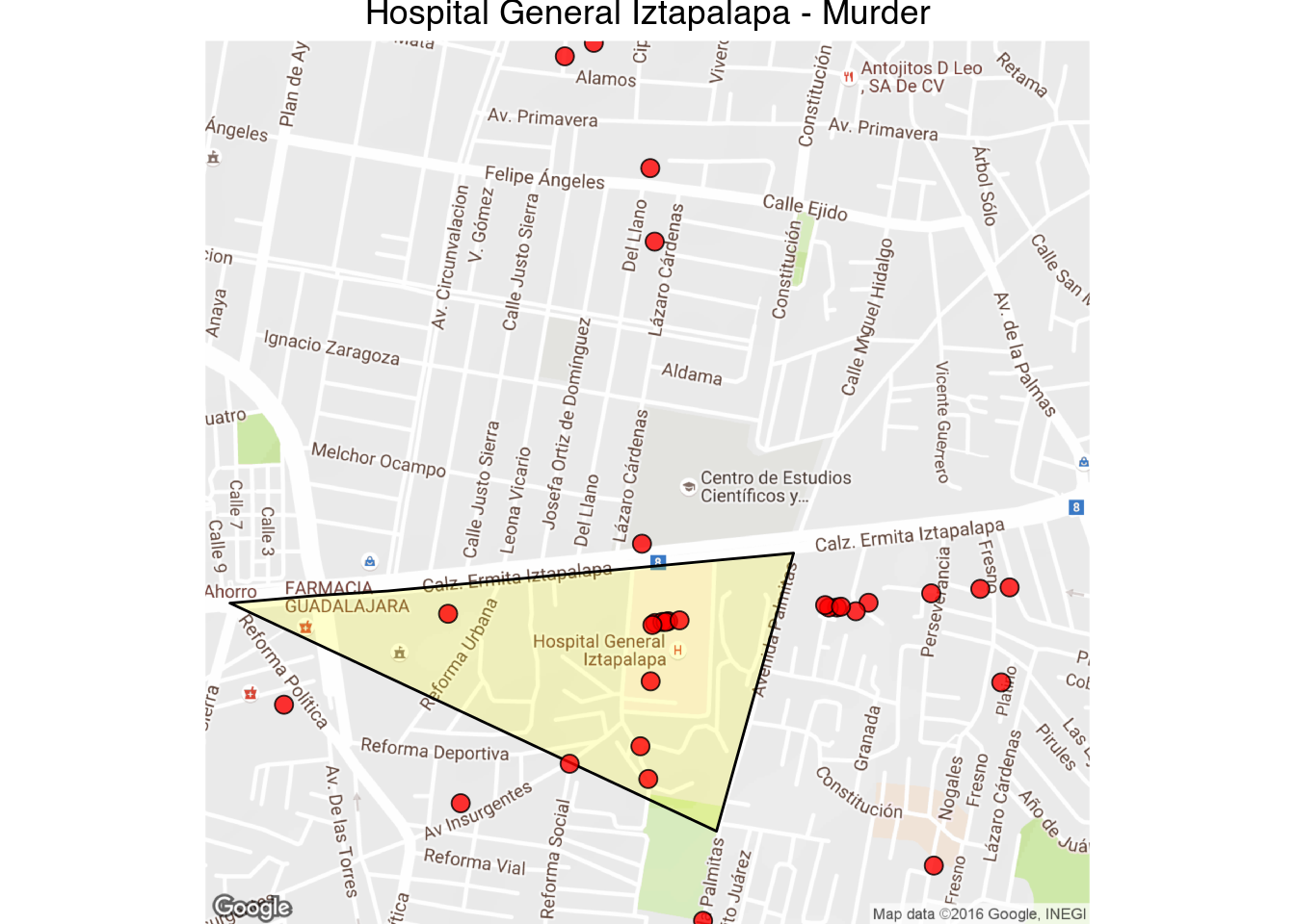
1 | latlong_map("Hospital General Iztapalapa - Murder", 19.343515, -99.027382, 1000)
|
1 2 3 4 | latlong_map("Hospital General Iztapalapa - Firearm Lesions",
19.343515, -99.027382,
1000,
"LESIONES POR ARMA DE FUEGO", fill = "darkgray")
|
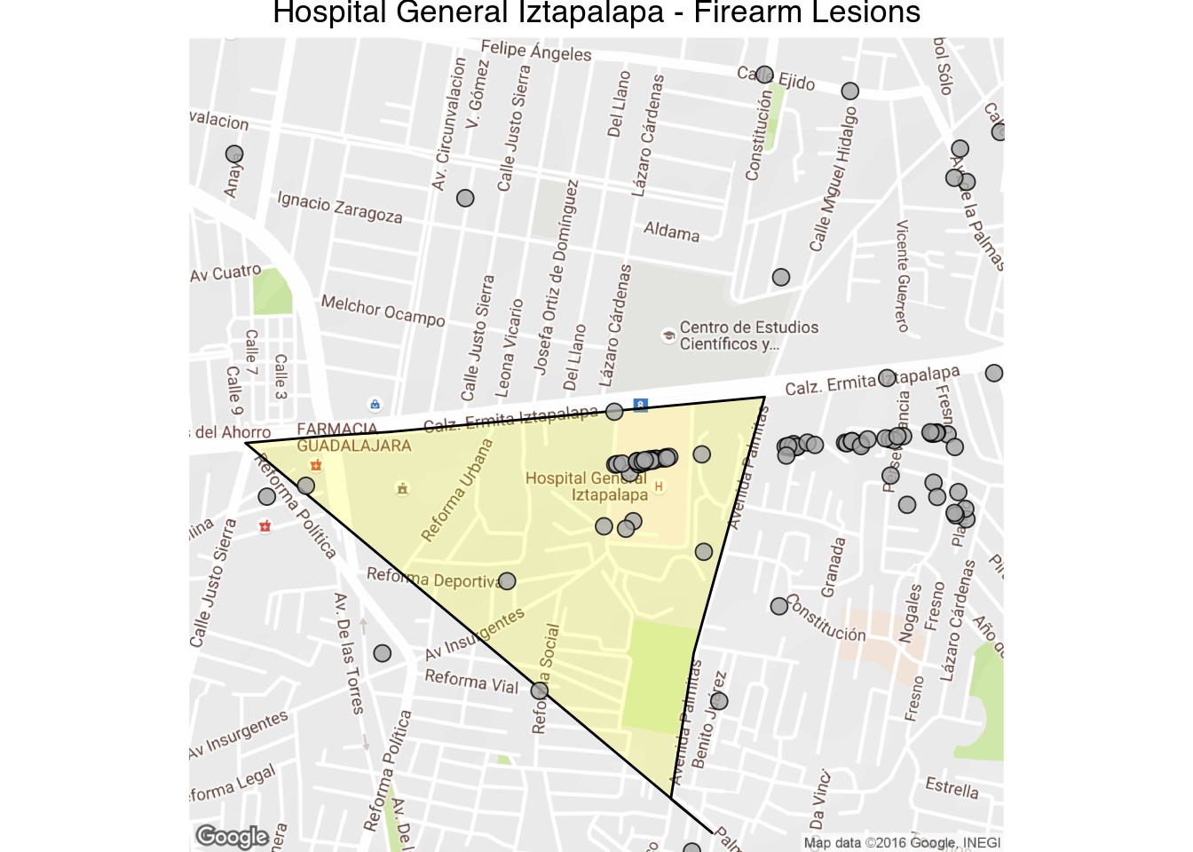
While narcos sometimes kill the wounded receiving care in hospitals, this is the exception rather than the rule. It looks like some homicides are recorded with the latitude and longitude of the place of death, and in the case of firearm lesions I’m guessing it’s where the crime was reported to the police. Also note that there is a certain amount of error associated with the location of each crime, while the cuadrante where the crime was recorded is usually correct, the latitude and longitude sometimes is off by a 100 meters or so.
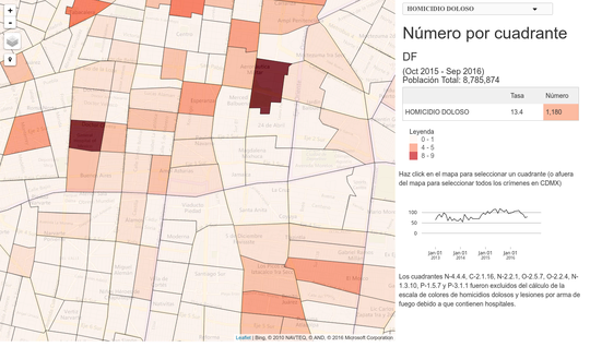
These are the cuadrantes codes with hospitals and an unusual number of victims:
- O-2.5.7
- O-2.2.4
- N-4.4.4
- N-1.3.10
- C-2.1.16
- N-2.2.1
- P-1.5.7
- P-3.1.1
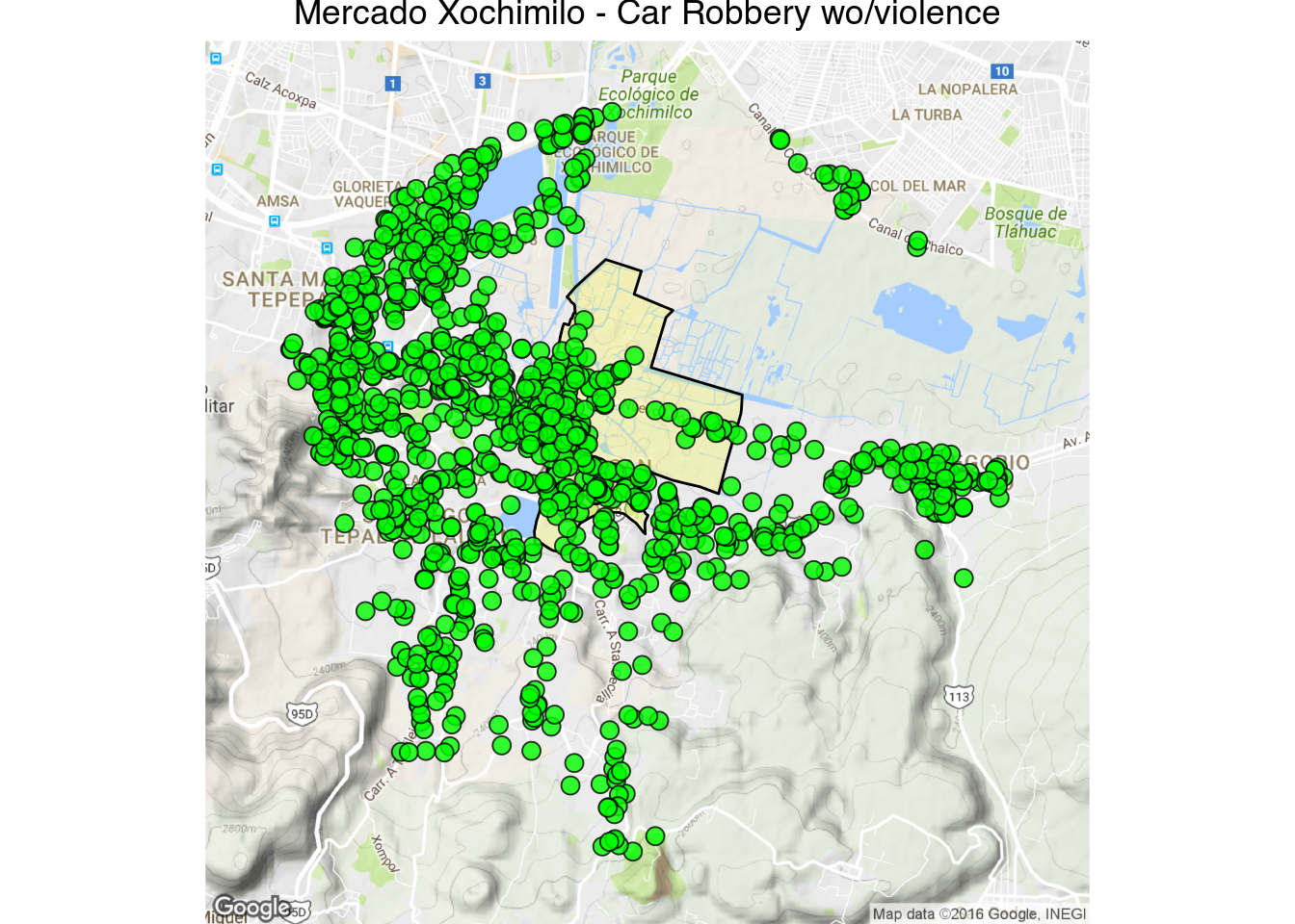
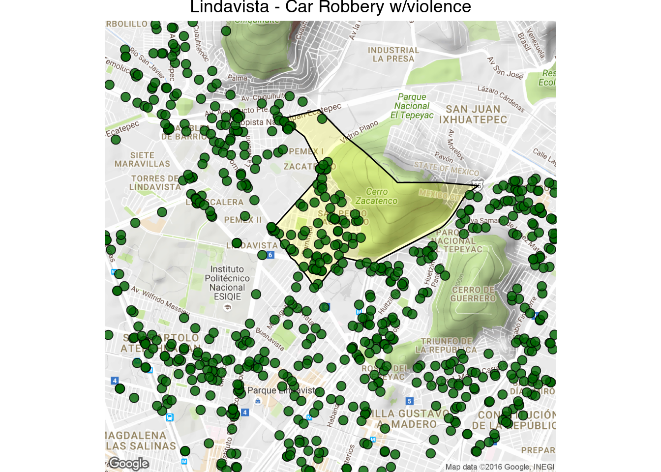
Just for fun here are the cuadrantes with the highest counts of car robbery:
1 | latlong_map("Mercado Xochimilo - Car Robbery wo/violence", 19.251478, -99.094207, 1000, "ROBO DE VEHICULO AUTOMOTOR S.V.", fill = "green")
|
1 | latlong_map("Lindavista - Car Robbery w/violence", 19.506460, -99.122815, 1000, "ROBO DE VEHICULO AUTOMOTOR C.V.", fill = "darkgreen")
|
IV.
Ideally we’d like to be able to map the rates of crimes at the cuadrante delictivo level, like we did with the sectores, but the crime rates can be statistically unstable due to the small size of the cuadrantes and the relative small number of people at risk. Plus, as I mentioned, homicides and firearm lesions are sometimes recorded as having happened inside a hospital. To get a better sense of the crime risk in each cuadrante we are going to smooth the rate using empirical bayes smoothing:
1 2 3 4 5 6 7 8 9 10 11 12 13 14 15 16 17 18 19 20 21 22 23 24 25 26 27 28 | # Construct neighbours list from polygon list
cuad.nb <- poly2nb(cuadrantes, row.names = as.character(cuadrantes$cuadrante))
hom <- fromJSON(str_c("https://hoyodecrimen.com",
URLencode("/api/v1/cuadrantes/ALL/crimes/HOMICIDIO DOLOSO/period")))$rows
hom <- subset(hom, cuadrante != "(NO ESPECIFICADO)")
# match the order with the neighborhood file
hom <- hom[match(cuadrantes$cuadrante, hom$cuadrante),]
# fill in the population of cuadrantes with zero residents
# with the mean of their neighboring cuadrantes
for(zero_cuad in hom$cuadrante[which(hom$population == 0)])
hom$population <- mean(hom$population[cuad.nb[[which(hom$cuadrante == zero_cuad)]]])
hom$rate <- hom$count / hom$population * 10^5
smth<-empbaysmooth(hom$count, hom$population * sum(hom$count) / sum(hom$population))
hom$smooth <- smth$smthrr
cuadrantes.f <- fortify(cuadrantes, region = "cuadrante")
cuadrantes.f <- merge(cuadrantes.f, hom, by.x = "id", by.y = "cuadrante")
ggplot(cuadrantes.f, aes(long, lat, group = group)) +
geom_polygon(aes(fill = smooth), color = "#555555", size = .1) +
coord_map()+
scale_fill_gradientn(colours=rev(brewer.pal(9,"YlOrRd"))) +
theme_nothing(legend = TRUE) +
ggtitle("Smoothed homicide rates at the cuadrante level")
|
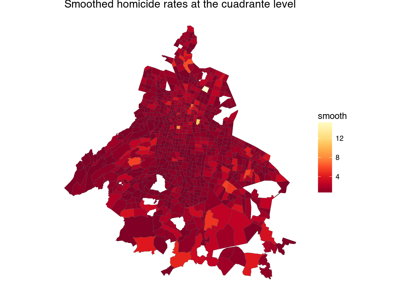
The cuadrantes with hospitals still give the impression of being extremely violent. One interesting thing about hospital with lots of murders is that the cuadrantes surrounding them also tend to have a lot of murders —there is a lot of violence near some hospitals.
This makes it more likely that the people who died in a hospital were injured in a nearby location and were then transported to the nearest hospital. A solution to the problem of cuadrantes with hospitals being incorrectly perceived as very violent would be to average the rate of violence in each cuadrante with the nearest, say, 8 neighbors.
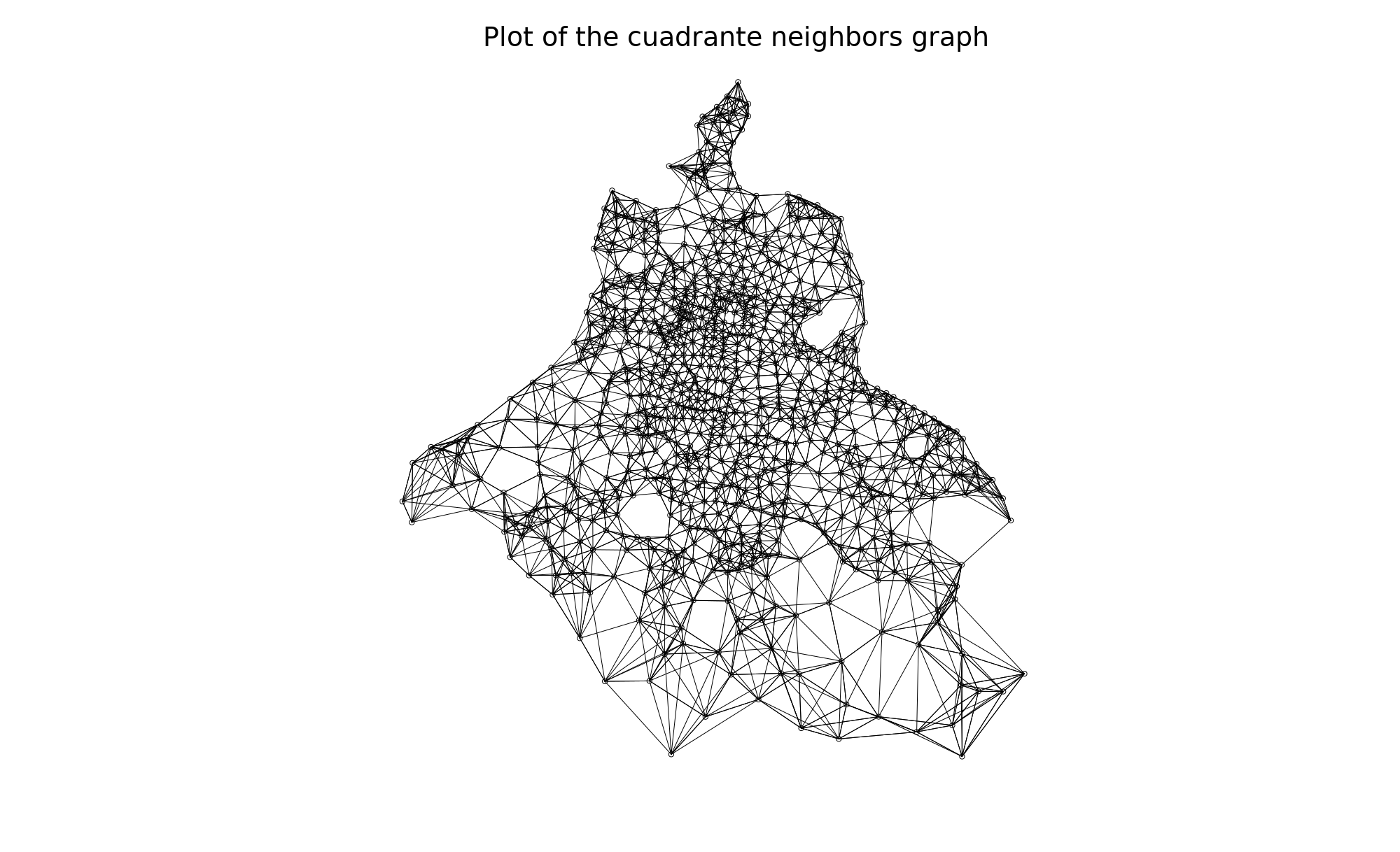
1 2 3 4 5 6 7 8 9 10 11 12 13 14 15 16 17 18 19 20 | cuad.nb <- knn2nb(knearneigh(coordinates(cuadrantes), k = 8),
row.names = as.character(cuadrantes$cuadrante))
#cuad.nb <- poly2nb(cuadrantes, row.names = as.character(cuadrantes$cuadrante))
plot(cuad.nb, coordinates(cuadrantes))
hom$smooth <- sapply(1:nrow(hom), function(x) {
w <- c(hom$population[x], hom$population[cuad.nb[[x]]])
r <- c(hom$rate[x], hom$rate[cuad.nb[[x]]])
return(sum(w * r)/sum(w))
})
cuadrantes.f <- fortify(cuadrantes, region = "cuadrante")
cuadrantes.f <- merge(cuadrantes.f, hom, by.x = "id", by.y = "cuadrante")
ggplot(cuadrantes.f, aes(long, lat, group = group)) +
geom_polygon(aes(fill = smooth), color = "#555555", size = .1) +
coord_map()+
scale_fill_gradientn(colours=rev(brewer.pal(9,"YlOrRd"))) +
theme_nothing(legend = TRUE) +
ggtitle("Smoothed homicide rates by nearest neighbors")
|

Now it looks much better, and this is what the frontpage of hoyodecrimen uses to compare crime rates in your cuadrante (though we’re still missing uncertainty estimates). We can use the same averaging method for other crimes:
1 2 3 4 5 6 7 8 9 10 11 12 13 14 15 16 17 18 19 20 21 22 23 24 25 26 27 28 29 30 31 32 33 34 | smooth_cuads <- function(df, cuad.nb) {
df <- subset(df, cuadrante != "(NO ESPECIFICADO)")
# match the order with the neighborhood file
df <- df[match(cuadrantes$cuadrante, df$cuadrante),]
# fill in the population of cuadrantes with zero residents
# with the mean of their neighboring cuadrantes
for(zero_cuad in df$cuadrante[which(df$population == 0)])
df$population <- mean(df$population[cuad.nb[[which(df$cuadrante == zero_cuad)]]])
df$rate <- df$count / df$population * 10^5
df$smooth <- sapply(1:nrow(df), function(x) {
w <- c(df$population[x], df$population[cuad.nb[[x]]])
r <- c(df$rate[x], df$rate[cuad.nb[[x]]])
return(sum(w * r)/sum(w))
})
cuadrantes.f <- fortify(cuadrantes, region = "cuadrante")
cuadrantes.f <- merge(cuadrantes.f, df, by.x = "id", by.y = "cuadrante")
cuadrantes.f
}
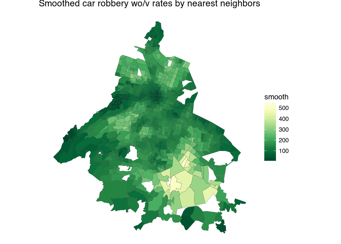
#cuad.nb <- poly2nb(cuadrantes, row.names = as.character(cuadrantes$cuadrante))
cuad_smooth_rvsv <- smooth_cuads(fromJSON("https://hoyodecrimen.com/api/v1/cuadrantes/ALL/crimes/ROBO DE VEHICULO AUTOMOTOR S.V./period")$rows,
cuad.nb)
ggplot(cuad_smooth_rvsv, aes(long, lat, group = group)) +
geom_polygon(aes(fill = smooth), color = "#555555", size = .1) +
coord_map()+
scale_fill_gradientn(colours=rev(brewer.pal(9,"YlGn"))) +
theme_nothing(legend = TRUE) +
ggtitle("Smoothed car robbery wo/v rates by nearest neighbors")
|
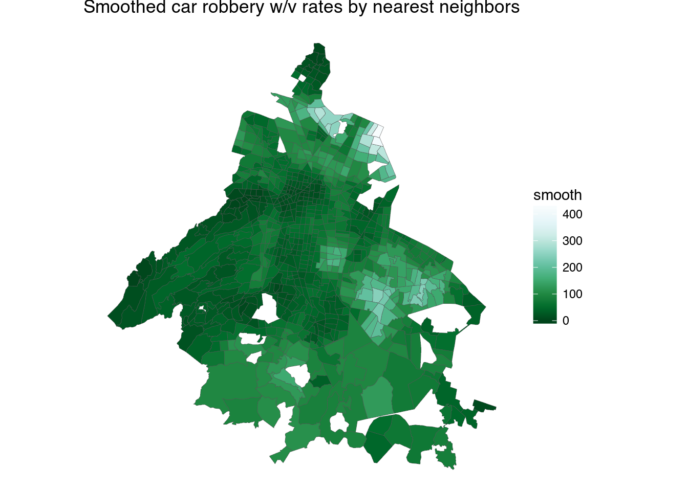
1 2 3 4 5 6 7 8 9 | cuad_smooth_rvcv <- smooth_cuads(fromJSON("https://hoyodecrimen.com/api/v1/cuadrantes/ALL/crimes/ROBO DE VEHICULO AUTOMOTOR C.V./period")$rows,
cuad.nb)
ggplot(cuad_smooth_rvcv, aes(long, lat, group = group)) +
geom_polygon(aes(fill = smooth), color = "#555555", size = .1) +
coord_map() +
scale_fill_gradientn(colours=rev(brewer.pal(9,"BuGn"))) +
theme_nothing(legend = TRUE) +
ggtitle("Smoothed car robbery w/v rates by nearest neighbors")
|
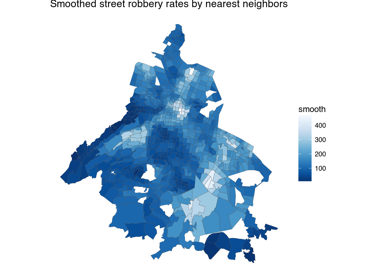
1 2 3 4 5 6 7 8 9 | cuad_smooth_rt <- smooth_cuads(fromJSON("https://hoyodecrimen.com/api/v1/cuadrantes/ALL/crimes/ROBO A TRANSEUNTE C.V./period")$rows,
cuad.nb)
ggplot(cuad_smooth_rt, aes(long, lat, group = group)) +
geom_polygon(aes(fill = smooth), color = "#555555", size = .1) +
coord_map() +
scale_fill_gradientn(colours=rev(brewer.pal(9,"Blues")))+
theme_nothing(legend = TRUE) +
ggtitle("Smoothed street robbery rates by nearest neighbors")
|
There’s still a problem in that to calculate the rates we are using as denominator the number of people living in the cuadrante, and people move around the city all time.
V.
The Mexico City subway website publishes the number of passangers using each metro station which we can use to estimate crime rates by station. First, we download crime data from January to March 2016 since that matches the ridership data available from the Sistema Colectivo website. And we’ll only estimate rates for the sum of the following crimes:
- ROBO A TRANSEUNTE C.V.
- ROBO A TRANSEUNTE S.V.
- ROBO A BORDO DE TAXI C.V
- ROBO A BORDO DE MICROBUS S.V.
- ROBO A BORDO DE MICROBUS C.V.
- ROBO A BORDO DE METRO S.V.
- ROBO A BORDO DE METRO C.V.
1 2 3 | # Set the distance to ridiculously large number of meters to download all CDMX data
geocrimes <- fromJSON(str_c("https://hoyodecrimen.com/api/v1/latlong/crimes/",
URLencode("ROBO A TRANSEUNTE C.V.,ROBO A TRANSEUNTE S.V.,ROBO A BORDO DE TAXI C.V.,ROBO A BORDO DE MICROBUS S.V.,ROBO A BORDO DE MICROBUS C.V.,ROBO A BORDO DE METRO S.V.,ROBO A BORDO DE METRO C.V."),"/coords/-99.122815/19.506460/distance/50000000000?start_date=2016-01&end_date=2016-04"))$rows
|
Then we clean the ridership data from the metro website. I had to clean up the html by hand a bit since it’s so badly formed the rvest package was unable to parse it.
1 2 3 4 5 6 7 8 9 10 11 12 13 14 15 16 17 18 19 20 21 22 23 24 25 26 27 28 29 30 31 32 33 34 35 36 37 | con <- file("data/afluencia.html", "rb")
metro <- read_html(con)
afluencia <- data.frame()
for(i in 1:4) {
df <- metro %>%
html_nodes("table") %>%
.[[i]] %>%
html_table(fill = TRUE)
afluencia <- rbind(afluencia,
data.frame(name=df[2:(nrow(df)-1),1],
num=df[2:(nrow(df)-1),2],
line=df[1,1]),
data.frame(name=df[2:(nrow(df)-1),4],
num=df[2:(nrow(df)-1),5],
line=df[1,4]),
data.frame(name=df[2:(nrow(df)-1),7],
num=df[2:(nrow(df)-1),8],
line=df[1,7]))
}
nbs <- stri_escape_unicode(afluencia$name[21])
# \\u00a0 is actually the non-breaking space character
# which we have to remove from the html table
afluencia <- afluencia %>%
mutate(num = as.numeric(str_replace_all(num, ",", ""))) %>%
mutate(name = str_replace_all(name, "[\r\n]" , " ")) %>%
mutate(name = str_replace_all(name, " " , " ")) %>%
mutate(name = str_replace(name, "\\u00a0", "")) %>%
mutate(name = str_replace(name, " ", " ")) %>%
mutate(name = tolower(name)) %>%
filter(name != "") %>%
mutate(line = str_replace_all(line, "[\r\n]" , " ")) %>%
mutate(line = str_replace_all(line, " " , " ")) %>%
mutate(line = str_replace_all(line, " " , " "))
|
Then we merge the ridership numbers with a list of geocoded stations previously download from here and converted to a csv with the latitude and longitude of each metro station.
1 2 3 4 5 6 7 | stations <- read.csv("data/stations.csv") %>%
mutate(name = tolower(name)) %>%
rename(line = styleUrl) %>%
mutate(line = str_replace(line, "#Line", "LÍNEA "))
df <- full_join(stations, afluencia, by = c("name", "line"))
nrow(df[is.na(df$X) | is.na(df$num),]) == 0
|
To compute the rates by station we are going to draw a 200m buffer around each station point. Sometimes stations are very close to each other and we have to be sure to merge them and sum their ridership numbers if their buffers intersect. This can be done by using Postgresql with the following SQL code:
1 2 3 4 5 6 7 8 9 10 11 12 | SELECT json_build_object(
'type', 'Feature',
'id', name,
'geometry', ST_Union(the_geom::geometry),
'properties', json_build_object(
'name', name,
'num', sum(num)
)
)
FROM (SELECT ST_Buffer(the_geom_webmercator::geometry,200) as the_geom,name, line, num
FROM geocoded_stations) as buffers
GROUP BY name
|
I’ve also uploaded the station points to carto so you don’t have to install Postgresql and can download the geojson file of the station buffers by running the SQL in the cloud.
1 2 3 4 5 6 7 8 9 | url <- str_c("https://diegovalle.carto.com/api/v2/sql?format=GeoJSON&q=",
URLencode("SELECT ST_Transform(ST_Union(the_geom),4326) as the_geom, name, sum(num)
from (SELECT ST_Buffer(the_geom_webmercator,200) as the_geom,name, line, num
from geocoded_stations) as buffers
GROUP BY name"))
stations_merged <- geojson_read(url, method = "local", what = "sp")
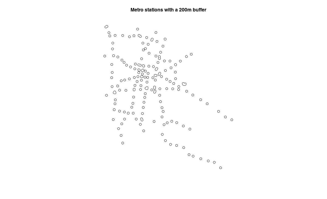
plot(stations_merged, main = "Metro stations with a 200m buffer")
|
Note the merged stations. Now its just a matter of counting the number of crimes inside each of the polygons taking into account the stations that were merged.
1 2 3 4 5 6 7 8 9 | SELECT count(crime_lat_long.the_geom), stations.name AS name
FROM
(SELECT ST_Transform(ST_Union(the_geom),4326) as the_geom, name, sum(num)
from (SELECT ST_Buffer(the_geom_webmercator,200) as the_geom,name, line, num
from geocoded_stations) as buffers
GROUP BY name) as stations
LEFT JOIN crime_lat_long
ON st_contains(stations.the_geom, crime_lat_long.the_geom)
GROUP BY stations.name
|
Using carto:
1 2 3 4 5 6 7 8 9 10 11 12 13 14 15 16 | url <- str_c("https://diegovalle.carto.com/api/v2/sql?q=",
URLencode("SELECT count(crime_lat_long.the_geom), stations.name AS name
FROM
(SELECT ST_Transform(ST_Union(the_geom),4326) as the_geom, name, sum(num)
from (SELECT ST_Buffer(the_geom_webmercator,200) as the_geom,name, line, num
from geocoded_stations) as buffers
GROUP BY name) as stations LEFT JOIN
crime_lat_long
ON st_contains(stations.the_geom, crime_lat_long.the_geom)
GROUP BY stations.name"))
numcrime <-fromJSON(url)$rows
stations_merged@data <- left_join(stations_merged@data,
numcrime,
by = c("name" = "name"))
|
1 2 3 4 5 6 7 8 9 10 11 12 13 14 15 16 17 18 19 20 21 22 23 24 25 26 27 28 29 30 31 | stations_merged@data$rate <- stations_merged@data$count / stations_merged@data$sum * 10^5
# Exclude stations not inside CDMX (crime data only available in CDMX)
stations_merged <- stations_merged[!stations_merged@data$name %in% c("los reyes",
"la paz",
"nezahualcóyotl",
"impulsora",
"río de los remedios",
"múzquiz",
"tecnológico",
"olímpica",
"plaza aragón",
"ciudad azteca",
"cuatro caminos"), ]
# Write a geojson file for the interactive html version
writeOGR(stations_merged,
"html/stations.geojson",
driver = "GeoJSON",
layer = "stations.geojson",
verbose = FALSE)
map <- fortify(stations_merged, region = "name")
map <- left_join(map, stations_merged@data,by = c("id" = "name"))
bb <- bbox(stations_merged)
ggmap(get_map(location = bb)) +
geom_polygon(data= subset(map, rate != 0),
aes(long, lat, group = group, fill = rate)) +
scale_fill_continuous(low = "#ffeda0", high = "#f03b20") +
ggtitle(title) +
theme_nothing(legend = TRUE) +
ggtitle("Crime by Mexico City Metro Station")
|
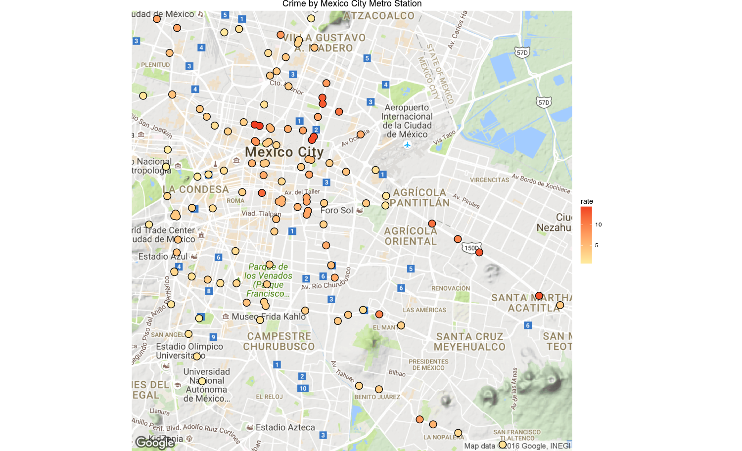
And there you have it, a chart with the crime rates by metro station. There’s still a problem in that the crimes may be systematically biased since the reporting rate is so low in Mexico (93% according to the ENVIPE 2016).
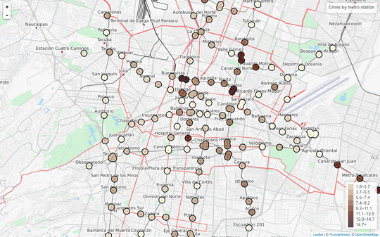
You can also view an interactive version here
P.S. You can download the code from GitHub